New PlumX Feature: Enhanced Researcher Visualizations / Metrics Previews
From the beginning of our company’s history, we’ve focused on not just the data, but being able to visualize and quickly discover the stories that are contained in it. Per researcher, one question that often gets asked is. “What has that researcher done that has gotten the most engagement?”
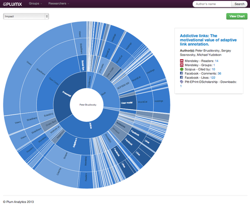
Our sunburst visualization can be sorted by impact to weight the artifacts (articles, blogs, presentations, etc.) that have the most engagement. With this visualization, the works that have less impact fade into the background, and the works that have the most engagement have a “larger slice of pie.”
We have just added more interactivity to this visualization by giving you a quick summary of all of the metrics about a particular artifact just by hovering over the wedge in the sunburst. Of course, if you click on the artifact, you can also drill into the details of the metrics, including linking back to where we harvested the metric.
To see these features live, register for our beta at http://try.plu.mx.